Build consistent cross-platform mobile apps at lightning speed
Pearl UI is a user-friendly UI library for React Native, offering ready-to-use components, framer-motion-like animations, dark mode, and responsive design. With its design-first approach and intuitive styling system, Pearl UI greatly enhances developer efficiency, simplifying and accelerating app development.
Read the docs Star()
Customizable
Customize every component to fit your design needs. The entire theme can be controlled via a single config file.
Accessible
All components follow the official Android and Apple accessibility guidelines, while providing support for screen readers.
Dark Mode
Out of the box support for multiple color modes. Let it be light, dark, or based on users' system preferences.
Animations
Built-in animations to enhance your UI. Smooth and responsive animations are readily available for a dynamic user experience.
Developer Experience
Boost your productivity during development with the help of style props and modular components
Extendable
Follows the Atomic Design methodology to provide you with modular components that can be used to build complex interfaces.
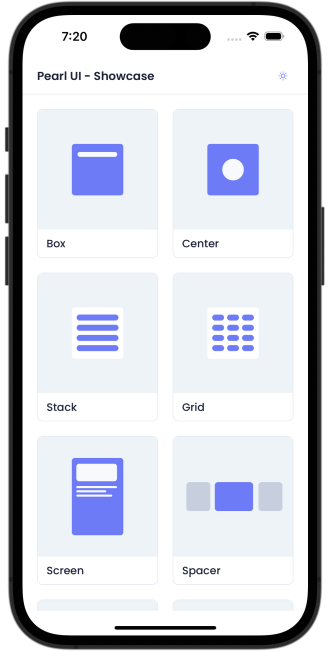
Check out Pearl UI in action!
Simply scan the QR code using the Expo app on your device or click here to view a live demo showcasing the ready-to-use components and intuitive animations that Pearl UI offers.