Image
The Image component is a versatile tool for displaying images in your application. It supports both local and remote images, and includes built-in features for image fallback, caching, and progressive loading. The Image component is built on top of the React Native Image component.
Import#
import { Image } from "pearl-ui";Usage#
// Displaying a local image<Image  width={200}  height={200}  source={require("<path-to-local-image>.jpeg")}/>
// Displaying an image from a remote source<Image width={200} height={200} source={{ uri: "https://wallpaperaccess.com/full/1713248.jpg", }}/>Aspect Ratio#
The aspectRatio style prop can be used to maintain the aspect ratio of an image and prevent it from being cropped.
// Maintains aspect ratio for an image having fixed width<Image  width={200}  aspectRatio={4/3}  source={require("<path-to-local-image>.jpeg")}/>
// Maintains aspect ratio for an image having relative width<Image width="70%" aspectRatio={16/9} source={{ uri: "https://wallpaperaccess.com/full/1713248.jpg", }}/>Caching#
Caching is a useful feature for applications that handle a lot of heavy images. It allows images to load faster by storing them locally. The isCached prop can be used to enable or disable caching for individual images. By default, this value is set to true.
// The image is cached by default<Image  width={100}  height={100}  source={{    uri: "https://wallpaperaccess.com/full/1713248.jpg",  }}/>
// Don't cache a particular image<Image width={100} height={100} isCached={false} source={{ uri: "https://wallpaperaccess.com/full/1713248.jpg", }}/>Image loading indicators#
While a remote image is being downloaded, a temporary placeholder can be displayed as a loading indicator. This can significantly improve the user experience of your application. The Image component supports two types of loading indicators: progressive image loading and spinner loading.
Progressive image loading#
Progressive image loading displays a blurred low-quality image that gradually improves in resolution as the image is downloaded. This method is used in popular apps like Medium.

The loaderType and previewSource props can be used to enable progressive loading. The previewSource should be a low-resolution version of the source image.
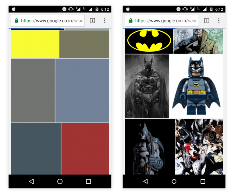
// The loaderType prop specifies that this image needs to be loaded progressively<Image width={100} height={100} loaderType="progressive" source={{ uri: "https://www.pixel4k.com/wp-content/uploads/2020/08/the-valley-minimal-4k_1596932776.jpg", }} previewSource={{ uri: "<url-of-the-preview-image>", }}/>If you do not have a preview source image, you can use the previewColor prop to emulate the progressive image loading behavior used in Google Image Search.
// The loaderType prop specifies that this image needs to be loaded progressively<Image width={100} height={100} loaderType="progressive" source={{ uri: "https://www.pixel4k.com/wp-content/uploads/2020/08/the-valley-minimal-4k_1596932776.jpg", }} previewColor="#934a9a"/>If both previewSource and previewColor props are specified, previewSource has a higher precedence.
Spinner loading#
You can also display a Spinner while the image is loading by setting the loaderType prop to
// The loaderType prop specifies that a spinner should be displayed while this image is being loaded<Image width={100} height={100} loaderType="spinner" source={{ uri: "https://www.pixel4k.com/wp-content/uploads/2020/08/the-valley-minimal-4k_1596932776.jpg", }}/>Image Fallback#
If an image cannot be displayed due to network issues or because it does not exist, a fallback image or component can be displayed instead. This can be achieved using the fallbackSource and fallbackComponent props.
// Displays an image saying 'No Image Available' if the source image doesn't exist<Image  width={100}  height={100}  fallbackSource={{    uri: "https://cdn.segmentnext.com/wp-content/themes/segmentnext/images/no-image-available.jpg",  }}  source={{    uri: "https://4kwallpapers.com/imas/wallpapers/macos-big-sur-apple-layers-fluidic-colorful-wwdc-stock-2560x1440-1455.jpg",  }}/>;
// Displays a custom component with an error icon if the source image doesn't existimport { Icon } from "pearl-ui";
<Image width={100} height={100} fallbackComponent={ <Icon iconFamily="MaterialIcons" iconName="error-outline" size="l" color="neutral.50" /> } source={{ uri: "https://4kwallpapers.com/imas/wallpapers/macos-big-sur-apple-layers-fluidic-colorful-wwdc-stock-2560x1440-1455.jpg", }}/>;If both fallbackComponent and fallbackSource props are specified, fallbackComponent has a higher precedence.
Override Styles#
The Image component supports a variety of style props that can be used to override the default component style. Any style props passed to the component will take precedence over the default component configuration.
<Image mt="5" boxShadow="xl" borderRadius="m" width="50%" height={200} source={{ uri: "https://wallpaperaccess.com/full/1713248.jpg", }}/>Example#
Accessibility#
Imagehas theroleofimage.
Component Properties#
Supported Styling Properties#
The Image component is built upon the Box component, hence all properties of Box can be applied to it.
Additional Properties#
Apart from the properties listed below, the Image component also inherits all properties of the React Native Image component from React Native.
| Name | Required | Type | Default | Description |
|---|---|---|---|---|
size | No | Defines the size of the image. | ||
variant | No | Specifies the variant of the image. | ||
isCached | No | true | Determines if a remote image should be cached. | |
loaderType | No | "spinner" | Specifies the type of loader to display until the image is fully loaded. | |
previewSource | No | Specifies the source of the placeholder image while the remote image is loading. | ||
previewColor | No | Defines the color of the image container while the remote image is loading. | ||
overlayTransitionDuration | No | 300 | Specifies the duration (in ms) for the progressive loading overlay to fade after the image loads. | |
sourceDelay | No | 0 | Delay (in ms) before the source image starts loading. This can be useful when you want to display a placeholder for a certain amount of time before starting to load the image. | |
imageDownloadOptions | No | {} | Configures the download options when fetching the remote image. | |
tint | No | "dark" | Specifies the tint of the progressive loading overlay. | |
fallbackComponent | No | Specifies a custom component to display if an error occurs while loading the image. | ||
fallbackSource | No | Specifies the source of the fallback image to display if an error occurs while loading the image. |