Responsive Design
Pearl UI is designed with a mobile-first approach and supports responsive styles right out of the box! This means that any style props can optionally accept a value for each screen size, as defined by the breakpoints configuration in the theme.
To make a style responsive, you can use the following object syntax:
propName={{ breakpoint: propValue }}Implementing Responsivity in Style Props#
To add responsivity to your style props, you can assign different values to different breakpoints. This allows you to customize the appearance of your components based on the screen size. Here's an example of how you can implement this:
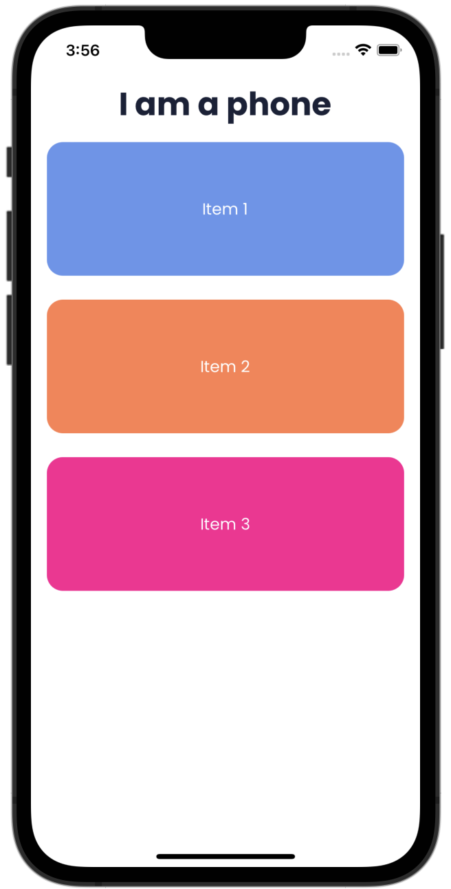
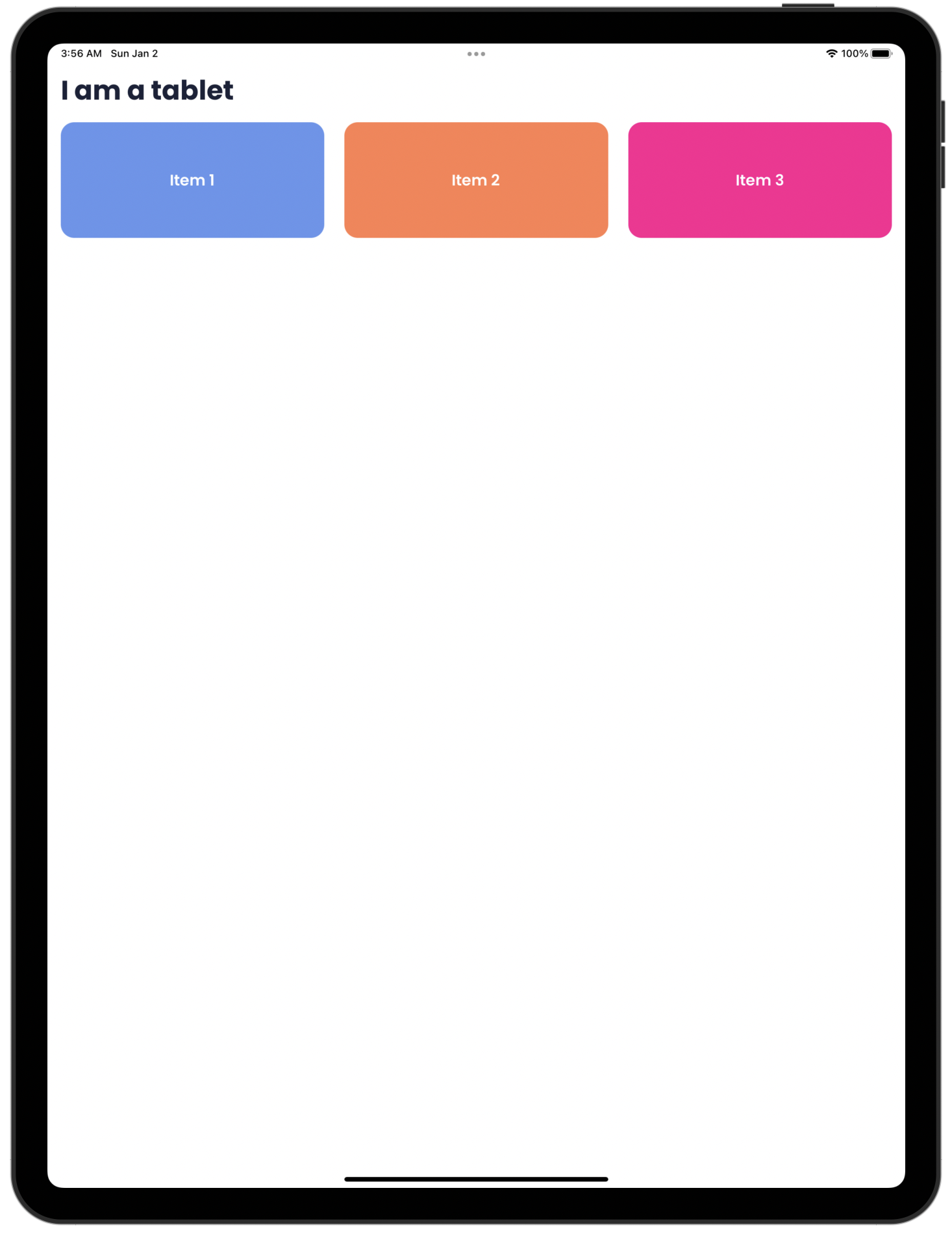
const Header = (props) => {  const heading = useResponsiveProp({    phone: "I am a phone",    tablet: "I am a tablet",  });
  return (    <Text      mb="m"      variant="h2"      alignSelf={{ phone: "center", tablet: "flex-start" }}    >      {heading}    </Text>  );};
const App = () => { return ( <ThemeProvider> <Screen> <Header /> <Box flexDirection={{ phone: "column", tablet: "row" }}> <Center backgroundColor="cornflowerblue" p="14" flex={1} borderRadius="l" > <Text color="neutral.50" variant={{ phone: "p2", tablet: "st1" }}> Item 1 </Text> </Center> <Center backgroundColor="coral" p="14" flex={1} borderRadius="l" marginVertical={{ phone: "l", tablet: null }} marginHorizontal={{ phone: null, tablet: "l" }} > <Text color="neutral.50" variant={{ phone: "p2", tablet: "st1" }}> Item 2 </Text> </Center> <Center backgroundColor="deeppink" p="14" flex={1} borderRadius="l"> <Text color="neutral.50" variant={{ phone: "p2", tablet: "st1" }}> Item 3 </Text> </Center> </Box> </Screen> </ThemeProvider> );};Custom Prop Responsivity#
Pearl UI extends its responsivity features beyond the built-in style props. You can add responsive behavior to any custom prop using the useResponsiveProp hook. This powerful feature allows for greater flexibility and control over your component's behavior across different screen sizes.
const CustomComponent = styled.View`  width: ${(props) => props.theme.space[props.size]};  height: ${(props) => props.theme.space[props.size]};`;
const App = () => {  const size = useResponsiveProp({ phone: "m", tablet: "l" });
return ( <ThemeProvider> <Screen> <Header /> <Box flexDirection={{ phone: "column", tablet: "row" }}> <CustomComponent size={size} /> </Box> </Screen> </ThemeProvider> );};In the above example, the CustomComponent is designed to adapt its size based on the device's screen size. It will have a medium size on phone screens and a large size on tablet screens, providing an optimal user experience across different devices.