Typescript Support
Pearl UI is designed to be developer-friendly and provides robust support for Typescript. This allows for real-time auto-completion in your IDE, making it easier to keep track of values in your custom design configuration.
Integrating Typescript with the Theme#
import { extendTheme, ThemeProvider, Box } from "pearl-ui";
// Define your custom themeconst theme = extendTheme({  palette: {    accent: {      100: "#b6fee2",      200: "#89fdd0",      300: "#5bfcbe",      400: "#2efbac",      500: "#00fa9a",      600: "#00cd7f",      700: "#00a163",      800: "#007448",      900: "#00472c",    },  },});
// To enable Typescript support for your theme, add the following code blocktype AppTheme = typeof theme;
declare module "pearl-ui" {  interface CustomPearlTheme extends AppTheme {}}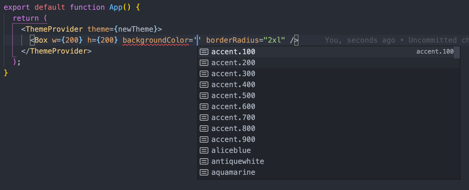
// In your App componentfunction App() { return ( // Pass the custom theme to `ThemeProvider` <ThemeProvider theme={theme}> {/* Now, you can utilize these colors in your components */} <Box w={200} h={200} backgroundColor="accent.200" borderRadius="2xl" /> </ThemeProvider> );}Visual Representation#