Customize Theme
Pearl UI provides a default theme that all components inherit values from. This theme includes a variety of design elements such as colors, spacing, and more. However, there may be instances where you need to customize these elements to better align with your application's design requirements.
With Pearl UI, you have the flexibility to:
- Modify theme tokens: This includes elements like colors, spacing, and more. You can either extend or override these tokens based on your needs.
- Alter component styles: You have the ability to change the base styles, sizes, or variants of components. This allows for greater control over the appearance and functionality of your components.
Customizing Theme Tokens#
Pearl UI allows you to extend or override the default theme tokens to better align with your design requirements. This can be achieved by using the extendTheme function and specifying the keys you wish to modify. You can also introduce new values to the theme.
Let's consider an example where you want to incorporate your brand colors into the theme. Here's how you can do it:
// Step 1: Import `extendTheme`import { extendTheme, ThemeProvider, Box } from "pearl-ui";
// Step 2: Invoke `extendTheme` and pass your custom valuesconst theme = extendTheme({  palette: {    primary: {      100: "#123312", // Lightest shade of your primary color      // ...      900: "#442441", // Darkest shade of your primary color    },
    tertiary: {      100: "#f7fafc", // Lightest shade of your tertiary color      // ...      900: "#1a202c", // Darkest shade of your tertiary color    },  },
  spacing: {    "3xs": 1, // Smallest spacing unit    "2xs": 2,    xs: 3,    // ...    "3xl": 98, // Largest spacing unit  },});
function App() { return ( // Step 3: Pass the new theme to `ThemeProvider` <ThemeProvider theme={theme}> {/* Step 4: Now you can use these colors in your components */} <Box bgColor="tertiary.100" p="0.25"> I'm a tertiary box! </Box> </ThemeProvider> );}In this example, we've extended the theme to include our brand's primary and tertiary colors. We've also added new spacing units. Now, these new colors and spacing units can be used across all components in your application.
Customizing Component Styles#
As your project grows, managing and customizing components in a scalable manner can become complex. It often requires significant developer expertise and frequent refactoring, which can slow down the delivery of your application. To address this, Pearl UI offers a robust styling API that allows you to style your components in several ways:
- Style Props: This approach allows you to add styles to a component by passing style properties as component props. It's a straightforward and intuitive way to style your components.
<Box backgroundColor="neutral.100" width="40%" height={200} borderStyle="solid" borderWidth={2} borderColor="tomato" borderRadius="l"/>- StyleSheets: This is the standard approach for styling components in React Native. It involves creating a StyleSheet object and passing it to the style prop of your component.
import { StyleSheet } from "react-native";
<Box style={styles.box} />;
const styles = StyleSheet.create({ box: { flex: 1, padding: 24, backgroundColor: "#eaeaea", },});- Component Style Config: This method, inspired by the
styleConfigAPI in Chakra UI, provides a consistent API for styling components through a single JSON file. This makes it easy to understand and maintain your component styles.
<Button size="s" variant="outline" />Each of these methods offers its own advantages, and you can choose the one that best suits your project's needs.
Component Style Config#
The Component Style Config API is a powerful tool that allows you to define and manage styles for your components in a standardized and scalable manner. This API is designed to handle the complexity of styling components that may have different sizes (e.g., small, medium, large) and visual variants (e.g., outline, solid, ghost).
The key features of this API are:
Base Styles: These are the default styles that are applied to a component. They serve as the foundation upon which other styles are built.
Size Styles: These styles are applied based on the size of the component. For example, a button component might have different padding or font size depending on whether it's small, medium, or large.
Variant Styles: These styles are applied based on the visual variant of the component. For example, a button component might have different background colors or border styles depending on whether it's outline, solid, or ghost.
Defaults: These denote the default size or variant for a component. If no size or variant is specified when a component is used, the defaults are applied.
By using the Component Style Config API, you can ensure consistency in your component styles, make your code easier to understand and maintain, and reduce the need for frequent refactoring.
Configuring Atomic Components#
Atomic components are the basic building blocks of your application's UI, as per the Atomic Design methodology. Examples of atomic components in Pearl UI include Text, Spinner, Icon, etc. These components use the useAtomicComponentConfig hook to apply their respective component style configurations.
The configuration format for an atomic component is as follows:
export default { // Base styles applicable to all sizes and variants baseStyle: {}, // Styles specific to size variations sizes: {}, // Styles specific to visual style variations variants: {}, // Default `size` or `variant` values defaults: {},};Here's an example of how the atomic component configuration is applied to the Icon component:
const newIconConfig = { // Common styles for all icons baseStyle: { color: { light: "neutral.900", // Color of the icon in light mode dark: "neutral.100", // Color of the icon in dark mode }, }, // Four sizes: s, m, l, and xl sizes: { s: { size: 15, // This is not a style prop, so it is passed directly to the ExpoIcons component used in the Pearl UI Icon component }, m: { size: 20, }, l: { size: 25, }, xl: { size: 30, }, }, // Three variants: neutral, primary, and secondary variants: { neutral: {}, // Since this is empty, it uses the baseStyle configuration primary: { color: "primary.500", // Overwrites the baseStyle configuration to always keep the color as 'primary.500' }, secondary: { color: "secondary.500", // Overwrites the baseStyle configuration to always keep the color as 'secondary.500' }, }, // Default size and variant values defaults: { size: "m", variant: "neutral", },};To include this new component configuration in your theme, update the theme as follows:
import { extendTheme } from "pearl-ui";
const theme = extendTheme({ components: { Icon: newIconConfig, },});Now, when you use the Icon component, these updates will be automatically applied:
<Box flexDirection="row" justifyContent="space-between"> <Icon iconFamily="Entypo" iconName="cup" size="s" variant="primary" /> <Icon iconFamily="Entypo" iconName="cup" size="m" variant="secondary" /></Box>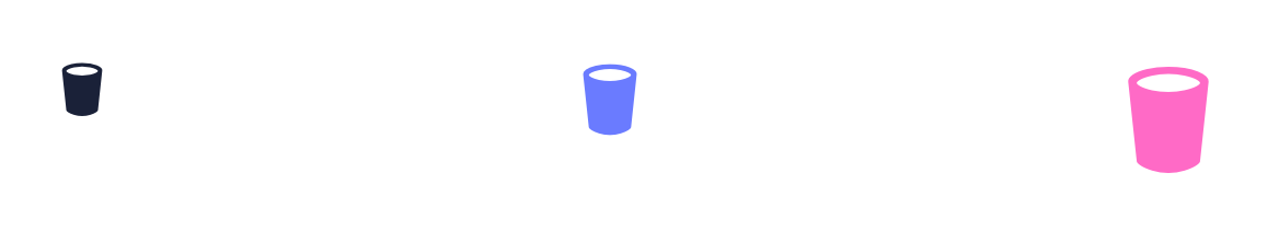
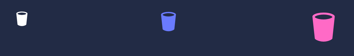
Light Mode
Dark Mode
Configuring Molecular Components#
Molecular components, analogous to Molecules in the Atomic Design methodology, are more complex components used in an actual app, such as Button, Datepicker, Modal, etc. These components use the useMolecularComponentConfig hook to enable their respective component style configuration.
The component config format for a molecular component is as follows:
export default { // The parts of the component parts: [], // Base styles that are common to all sizes/variants baseStyle: {}, // Styles for the size variations sizes: {}, // Styles for the visual style variations variants: {}, // The default `size` or `variant` values defaults: {},};Here's an example of a molecular component config applied to the Button component:
import {MolecularComponentConfig, ButtonAtoms} from 'pearl-ui'
const newButtonConfig: MolecularComponentConfig<ButtonAtoms> = { // Define the parts you want to use parts: ["pressable", "text", "spinner", "icon"], // The baseStyle config for all parts baseStyle: { // The styles all root parts would have in common pressable: { margin: "1", justifyContent: "center", alignItems: "center", }, }, // Two sizes: s and m sizes: { // Styles for all parts when the molecular component has size 's' s: { pressable: { py: "1.5", px: "1.5", borderRadius: "s", }, text: { variant: "h4", }, spinner: { size: "m", }, icon: { size: "m", }, }, // Styles for all parts when the molecular component has size 'm' m: { pressable: { py: "2", px: "2", borderRadius: "m", }, text: { variant: "h3", }, spinner: { size: "m", }, icon: { size: "m", }, }, }, // Two variants: filled and outline variants: { // Styles for all parts when the molecular component has variant 'filled' opaque: { pressable: { backgroundColor: "primary.500", }, text: { color: "neutral.100" }, spinner: { color: "neutral.100", }, icon: { color: "neutral.100", }, }, // Styles for all parts when the molecular component has variant 'outline' hollow: { pressable: { backgroundColor: { light: "neutral.100", dark: "neutral.800", }, borderWidth: 1, borderColor: "primary.500", }, text: { color: "primary.500" }, spinner: { color: "primary.500", }, icon: { color: "primary.500", }, }, }, // The default size and variant values for the molecular component defaults: { size: "m", variant: "opaque", },};To finalize the process, incorporate this new component configuration into the theme as shown below:
import { extendTheme } from "pearl-ui";
const theme = extendTheme({ components: { Button: newButtonConfig, },});With this setup, any usage of the Button component will automatically reflect these modifications:
<Button size="s" variant="opaque">Small Opaque button</Button><Button size="m" variant="hollow">Medium Hollow button</Button>This allows for a consistent look and feel across your application, while still providing the flexibility to customize individual components as needed.