Default Theme
The theme object is a powerful tool in Pearl UI. It allows you to define your application's color palette, typography, spacing scale, border radius scales, and more. It's not just about setting these values, but also creating and managing style variants for any components created using Pearl UI.
Color palette#
One of the key aspects of the theme object is the theme.palette object. This object provides the colors for your project. These colors can be referenced by the color, borderColor, backgroundColor, shadowColor, and textShadowColor style properties.
We recommend creating a palette that ranges from 100 to 900. There are several tools available to help you generate these palettes, such as Themera, Smart Swatch, Coolors, Eva Color Generator or Palx. Alternatively, you can use the generatePalette function included in the Pearl UI library.
Here's an example of how you can define your color palette in the theme object:
// theme.jsexport default {  palette: {    primary: {      50: "#F0F2FF",      100: "#E1E6FF",      200: "#C3CCFF",      300: "#A5B1FF",      400: "#8F9DFF",      500: "#6A7BFF",      600: "#4D5BDB",      700: "#3541B7",      800: "#212A93",      900: "#141B7A",    },
secondary: { 50: "#FFF1F4", 100: "#FFE1E7", 200: "#FFC3D6", 300: "#FFA5CB", 400: "#FF8FC9", 500: "#FF6AC6", 600: "#DB4DB3", 700: "#B7359F", 800: "#93218A", 900: "#78147A", }, // ... },};While Pearl UI provides a sensible default theme, it's designed to be fully customizable to fit your design needs.
Primary#
Primary 50
#F0F2FF
Primary 100
#E1E6FF
Primary 200
#C3CCFF
Primary 300
#A5B1FF
Primary 400
#8F9DFF
Primary 500
#6A7BFF
Primary 600
#4D5BDB
Primary 700
#3541B7
Primary 800
#212A93
Primary 900
#141B7A
Secondary#
Secondary 50
#FFF1F4
Secondary 100
#FFE1E7
Secondary 200
#FFC3D6
Secondary 300
#FFA5CB
Secondary 400
#FF8FC9
Secondary 500
#FF6AC6
Secondary 600
#DB4DB3
Secondary 700
#B7359F
Secondary 800
#93218A
Secondary 900
#78147A
Neutrals#
Neutral 50
#FFFFFF
Neutral 100
#F7F9FC
Neutral 200
#EDF1F7
Neutral 300
#E4E9F2
Neutral 400
#C5CEE0
Neutral 500
#8F9BB3
Neutral 600
#58617A
Neutral 700
#2E3A59
Neutral 800
#222B45
Neutral 900
#1A2138
Alerts#
Success#
Success 50
#F0FFF4
Success 100
#C6F6D5
Success 200
#9AE6B4
Success 300
#68D391
Success 400
#48BB78
Success 500
#38A169
Success 600
#2F855A
Success 700
#276749
Success 800
#22543D
Success 900
#1C4532
Info#
Info 50
#F5FDFF
Info 100
#D8F9FF
Info 200
#B2EFFF
Info 300
#8BE0FF
Info 400
#6FD0FF
Info 500
#3FB5FF
Info 600
#2E8EDB
Info 700
#1F6AB7
Info 800
#144B93
Info 900
#0C357A
Warning#
Warning 50
#FFFDF5
Warning 100
#FFF6CD
Warning 200
#FFEA9B
Warning 300
#FFDB6A
Warning 400
#FFCC45
Warning 500
#FFB407
Warning 600
#DB9305
Warning 700
#B77503
Warning 800
#935A02
Warning 900
#7A4601
Danger#
Danger 50
#FFEDEC
Danger 100
#FFE7D9
Danger 200
#FFCAB3
Danger 300
#FFA68D
Danger 400
#FF8371
Danger 500
#FF4B42
Danger 600
#DB3036
Danger 700
#B72133
Danger 800
#93152E
Danger 900
#7A0C2C
Named Colors#
In addition to the color palette defined above, Pearl UI also supports a range of CSS named colors. These colors are added to the default theme palette, providing a wider range of options for theming and styling. The following list includes all the supported named colors:
{ "transparent": "transparent", "aliceblue": "#f0f8ff", "antiquewhite": "#faebd7", "cyan": "#00ffff", "aquamarine": "#7fffd4", "azure": "#f0ffff", "beige": "#f5f5dc", "bisque": "#ffe4c4", "black": "#000000", "blanchedalmond": "#ffebcd", "blue": "#0000ff", "blueviolet": "#8a2be2", "brown": "#a52a2a", "burlywood": "#deb887", "cadetblue": "#5f9ea0", "chartreuse": "#7fff00", "chocolate": "#d2691e", "coral": "#ff7f50", "cornflowerblue": "#6495ed", "cornsilk": "#fff8dc", "crimson": "#dc143c", "darkblue": "#00008b", "darkcyan": "#008b8b", "darkgoldenrod": "#b8860b", "darkgray": "#a9a9a9", "darkgreen": "#006400", "darkkhaki": "#bdb76b", "darkmagenta": "#8b008b", "darkolivegreen": "#556b2f", "darkorange": "#ff8c00", "darkorchid": "#9932cc", "darkred": "#8b0000", "darksalmon": "#e9967a", "darkseagreen": "#8fbc8f", "darkslateblue": "#483d8b", "darkslategray": "#2f4f4f", "darkturquoise": "#00ced1", "darkviolet": "#9400d3", "deeppink": "#ff1493", "deepskyblue": "#00bfff", "dimgray": "#696969", "dodgerblue": "#1e90ff", "firebrick": "#b22222", "floralwhite": "#fffaf0", "forestgreen": "#228b22", "fuchsia": "#ff00ff", "gainsboro": "#dcdcdc", "ghostwhite": "#f8f8ff", "goldenrod": "#daa520", "gold": "#ffd700", "gray": "#808080", "green": "#008000", "greenyellow": "#adff2f", "honeydew": "#f0fff0", "hotpink": "#ff69b4", "indianred": "#cd5c5c", "indigo": "#4b0082", "ivory": "#fffff0", "khaki": "#f0e68c", "lavenderblush": "#fff0f5", "lavender": "#e6e6fa", "lawngreen": "#7cfc00", "lemonchiffon": "#fffacd", "lightblue": "#add8e6", "lightcoral": "#f08080", "lightcyan": "#e0ffff", "lightgoldenrodyellow": "#fafad2", "lightgreen": "#90ee90", "lightgrey": "#d3d3d3", "lightpink": "#ffb6c1", "lightsalmon": "#ffa07a", "lightseagreen": "#20b2aa", "lightskyblue": "#87cefa", "lightslategray": "#778899", "lightsteelblue": "#b0c4de", "lightyellow": "#ffffe0", "lime": "#00ff00", "limegreen": "#32cd32", "linen": "#faf0e6", "magenta": "#ff00ff", "maroon": "#800000", "mediumaquamarine": "#66cdaa", "mediumblue": "#0000cd", "mediumorchid": "#ba55d3", "mediumpurple": "#9370db", "mediumseagreen": "#3cb371", "mediumslateblue": "#7b68ee", "mediumspringgreen": "#00fa9a", "mediumturquoise": "#48d1cc", "mediumvioletred": "#c71585", "midnightblue": "#191970", "mintcream": "#f5fffa", "mistyrose": "#ffe4e1", "moccasin": "#ffe4b5", "navajowhite": "#ffdead", "navy": "#000080", "oldlace": "#fdf5e6", "olive": "#808000", "olivedrab": "#6b8e23", "orange": "#ffa500", "orangered": "#ff4500", "orchid": "#da70d6", "palegoldenrod": "#eee8aa", "palegreen": "#98fb98", "paleturquoise": "#afeeee", "palevioletred": "#db7093", "papayawhip": "#ffefd5", "peachpuff": "#ffdab9", "peru": "#cd853f", "pink": "#ffc0cb", "plum": "#dda0dd", "powderblue": "#b0e0e6", "purple": "#800080", "rebeccapurple": "#663399", "red": "#ff0000", "rosybrown": "#bc8f8f", "royalblue": "#4169e1", "saddlebrown": "#8b4513", "salmon": "#fa8072", "sandybrown": "#f4a460", "seagreen": "#2e8b57", "seashell": "#fff5ee", "sienna": "#a0522d", "silver": "#c0c0c0", "skyblue": "#87ceeb", "slateblue": "#6a5acd", "slategray": "#708090", "snow": "#fffafa", "springgreen": "#00ff7f", "steelblue": "#4682b4", "tan": "#d2b48c", "teal": "#008080", "thistle": "#d8bfd8", "tomato": "#ff6347", "turquoise": "#40e0d0", "violet": "#ee82ee", "wheat": "#f5deb3", "white": "#ffffff", "whitesmoke": "#f5f5f5", "yellow": "#ffff00", "yellowgreen": "#9acd32"}Typography#
The theme provides a comprehensive typography system for your project. This system includes various objects that define the font family, font sizes, line heights, letter spacings, and font weights. Here's a brief overview of these objects:
theme.fonts: Specifies the font family names for different use-cases. For instance, you can define separate fonts for the body text, headings, and monospace text.theme.fontConfig: Constructs a mapping from font family names to font weights, font styles, and raw font names. This allows you to define different styles for each font weight (from 100 to 900) and style (normal and italic).theme.fontSizes: Defines the font sizes, ranging from "2xs" (extra extra small) to "12xl" (extra extra large).theme.lineHeights: Specifies the line heights corresponding to each font size.theme.letterSpacings: Sets the letter spacings for different font sizes.theme.fontWeights: Maps the font weight names to their respective numeric values.
Here's an example of how you can define these objects in your theme.js file:
// theme.jsexport const fonts = {  body: "Poppins",  heading: "Poppins",  mono: "Poppins",};
export const fontConfig = {  Poppins: {    100: {      normal: "Poppins-Hairline",      italic: "Poppins-HairlineItalic",    },    200: {      normal: "Poppins-Thin",      italic: "Poppins-ThinItalic",    },    300: {      normal: "Poppins-Light",      italic: "Poppins-LightItalic",    },    400: {      normal: "Poppins-Regular",      italic: "Poppins-RegularItalic",    },    500: {      normal: "Poppins-Medium",      italic: "Poppins-MediumItalic",    },    600: {      normal: "Poppins-SemiBold",      italic: "Poppins-SemiBoldItalic",    },    700: {      normal: "Poppins-Bold",      italic: "Poppins-BoldItalic",    },    800: {      normal: "Poppins-ExtraBold",      italic: "Poppins-ExtraBoldItalic",    },    900: {      normal: "Poppins-Black",      italic: "Poppins-BlackItalic",    },  },};
export const fontSizes = {  "2xs": 10,  xs: 12,  s: 14,  m: 16,  l: 18,  xl: 20,  "2xl": 22,  "3xl": 24,  "4xl": 26,  "5xl": 28,  "6xl": 30,  "7xl": 32,  "8xl": 34,  "9xl": 36,  "10xl": 38,  "11xl": 40,  "12xl": 42,};
export const lineHeights = {  "2xs": 14,  xs: 16,  s: 18,  m: 20,  l: 22,  xl: 24,  "2xl": 26,  "3xl": 28,  "4xl": 30,  "5xl": 32,  "6xl": 34,  "7xl": 36,  "8xl": 38,  "9xl": 40,  "10xl": 42,  "11xl": 44,  "12xl": 46,};
export const letterSpacings = {  xs: -2,  s: -1,  m: 0,  l: 2,  xl: 4,  "2xl": 6,  "3xl": 8,};
export const fontWeights = { hairline: "100", thin: "200", light: "300", normal: "400", medium: "500", semibold: "600", bold: "700", extrabold: "800", black: "900",};This typography system is then used by the Component Style Config of Text to create the variants below:
Headers#
Heading 1
Heading 2
Heading 3
Heading 4
Heading 5
Heading 6
Paragraph#
Paragraph - Large
Paragraph - Regular
Paragraph - Small
Paragraph - Tiny
Spacing#
The theme.spacing object in the theme controls the system for spacing. By default, these values can be referenced by the padding and margin style properties.
We use a t-shirt size naming convention for our sizing system, but it's customizable to fit your style.
// theme.jsexport default { spacing: { 0: 0, 0.25: 1, 0.5: 2, 0.75: 3, 1: 4, 1.5: 6, 2: 8, 2.5: 10, 3: 12, 3.5: 14, 4: 16, 5: 20, 6: 24, 7: 28, 8: 32, 9: 36, 10: 40, 12: 48, 14: 56, 16: 64, 20: 80, 24: 96, 28: 112, 32: 128, 36: 144, 40: 160, 44: 176, 48: 192, 52: 208, 56: 224, 60: 240, 64: 256, 72: 288, 80: 320, 96: 384, },};| Name | Space | |
|---|---|---|
0 | 1 | |
0.25 | 1 | |
0.5 | 2 | |
0.75 | 2 | |
1 | 4 | |
1.5 | 6 | |
2 | 8 | |
2.5 | 10 | |
3 | 12 | |
3.5 | 14 | |
4 | 16 | |
5 | 20 | |
6 | 24 | |
7 | 28 | |
8 | 32 | |
9 | 36 | |
10 | 40 | |
12 | 48 | |
14 | 56 | |
16 | 64 | |
20 | 80 | |
24 | 96 | |
28 | 112 | |
32 | 128 | |
36 | 144 | |
40 | 160 | |
44 | 176 | |
48 | 192 | |
52 | 208 | |
56 | 224 | |
60 | 240 | |
64 | 256 | |
72 | 288 | |
80 | 320 | |
96 | 384 |
Border Radius#
The theme.borderRadii object in the theme controls the system for border radii. By default, these values can be referenced by the borderRadius style properties.
We use a t-shirt size naming convention for our sizing system, but it's customizable to fit your style.
// theme.jsexport default { borderRadii: { none: 0, xs: 2, s: 4, m: 8, l: 16, xl: 24, "2xl": 32, full: 1000, },};Shadow/Elevation#
The theme.elevation object in the theme provides a system for managing shadows and elevations. These values can be referenced by the boxShadow style property by default.
Our sizing system follows a t-shirt size naming convention, but it's flexible and can be customized to suit your needs.
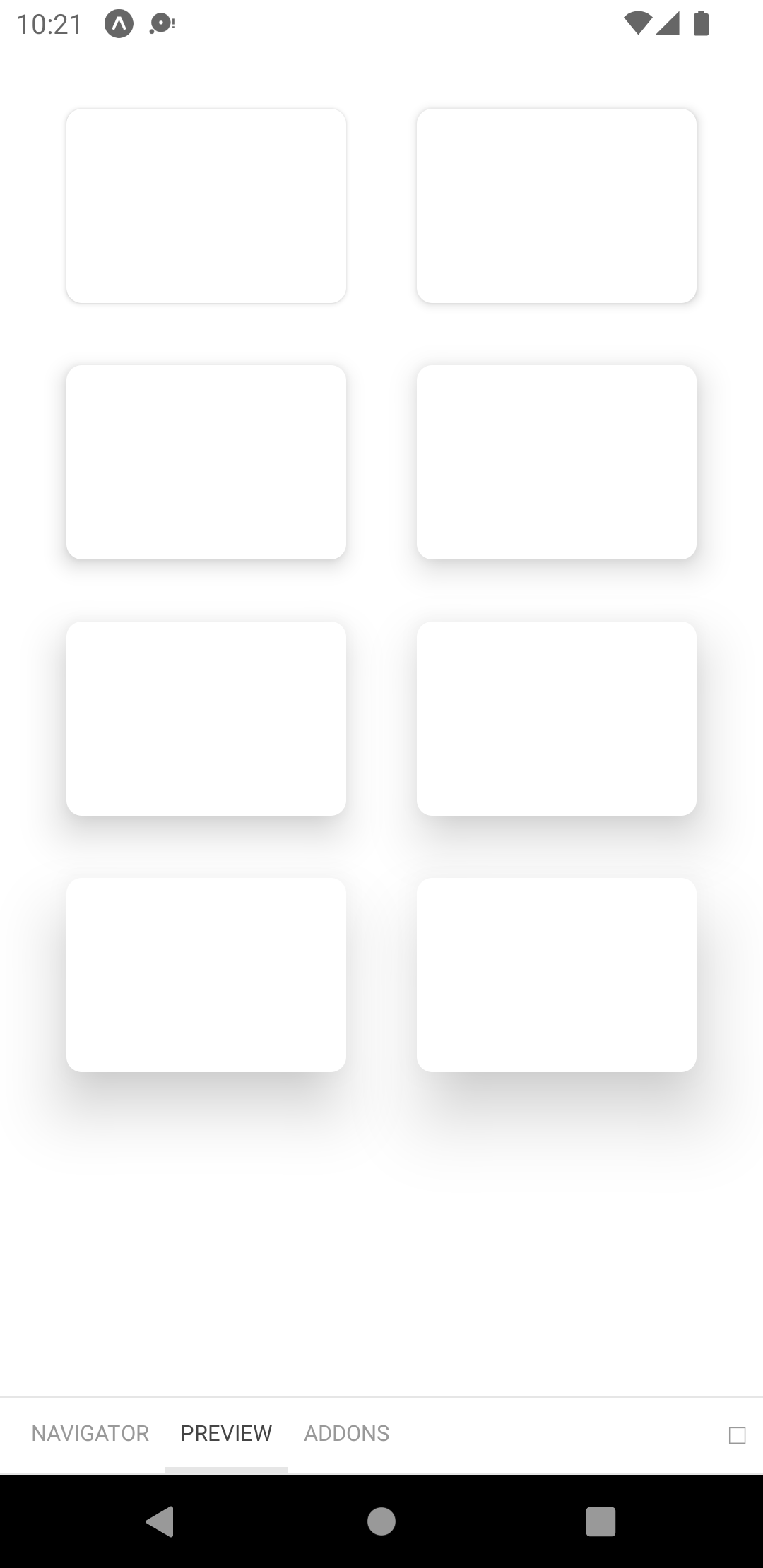
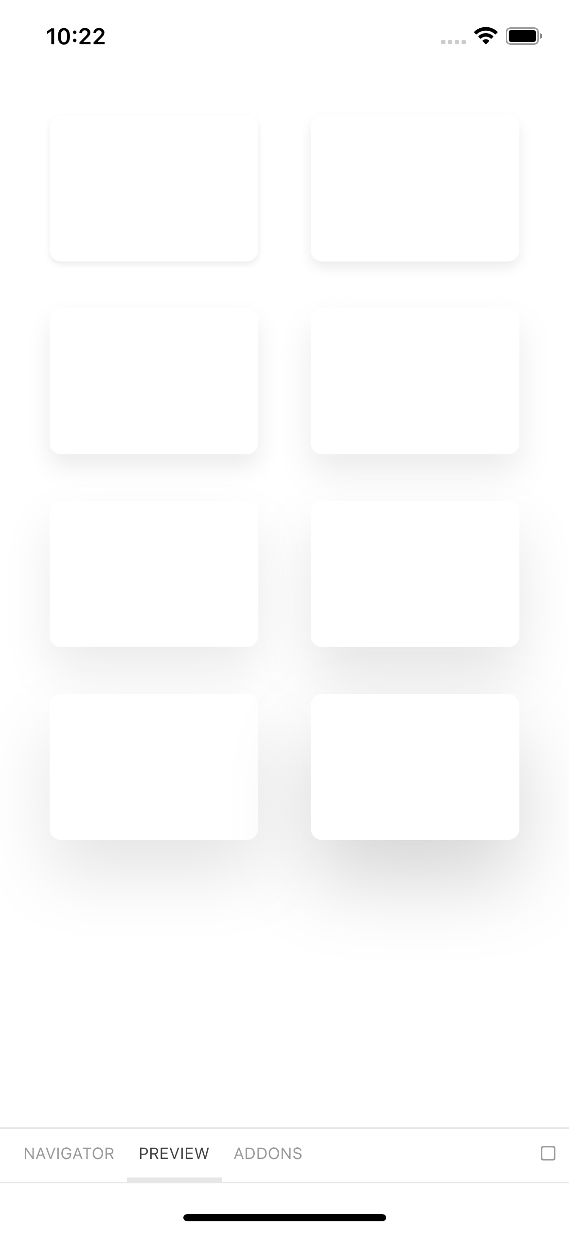
// theme.jsexport default { elevation: { none: { shadowColor: "#1A2138", shadowOffset: { width: 0, height: 0, }, shadowOpacity: 0, shadowRadius: 0, elevation: 0, }, xs: { shadowColor: "#1A2138", shadowOffset: { width: 0, height: 2, }, shadowOpacity: 0.08, shadowRadius: 2, elevation: 2, }, s: { shadowColor: "#1A2138", shadowOffset: { width: 0, height: 4, }, shadowOpacity: 0.08, shadowRadius: 4, elevation: 4, }, m: { shadowColor: "#1A2138", shadowOffset: { width: 0, height: 8, }, shadowOpacity: 0.08, shadowRadius: 8, elevation: 8, }, l: { shadowColor: "#1A2138", shadowOffset: { width: 0, height: 12, }, shadowOpacity: 0.08, shadowRadius: 12, elevation: 12, }, xl: { shadowColor: "#1A2138", shadowOffset: { width: 0, height: 16, }, shadowOpacity: 0.08, shadowRadius: 16, elevation: 16, }, "2xl": { shadowColor: "#1A2138", shadowOffset: { width: 0, height: 20, }, shadowOpacity: 0.1, shadowRadius: 20, elevation: 20, }, "3xl": { shadowColor: "#1A2138", shadowOffset: { width: 0, height: 24, }, shadowOpacity: 0.1, shadowRadius: 24, elevation: 24, }, "4xl": { shadowColor: "#1A2138", shadowOffset: { width: 0, height: 28, }, shadowOpacity: 0.16, shadowRadius: 28, elevation: 28, }, },};info
Please note that the appearance of box shadows may vary between Android and iOS platforms. Shadows on Android may appear more saturated, as depicted below. This discrepancy is attributed to the inherent limitations of the Android Elevation API.
Breakpoints#
The theme includes a theme.breakpoints object that defines pre-set breakpoints for various mobile devices. These breakpoints are defined as the minimum widths (inclusive) for different target screen sizes. They can be specified as either a single value (width) or an object that includes both width and height. This allows for more precise control over the layout and design of your application across different devices.
// theme.jsexport default { phone: 0, longPhone: { width: 0, height: 812, }, tablet: 768, largeTablet: 1024,};Z-Index Values#
The theme includes a theme.zIndices object that provides pre-set z-index values. These values are inspired by Chakra UI and can be used to efficiently manage the stacking order of components and resolve any stacking issues. The z-index values are as follows:
// theme.jsexport default { zIndices: { hide: -1, auto: "auto", base: 0, docked: 10, dropdown: 1000, sticky: 1100, banner: 1200, overlay: 1300, modal: 1400, popover: 1500, skipLink: 1600, toast: 1700, tooltip: 1800, },};